
I’ve lost count of the number of ecommerce and multi-location retail clients I’ve worked with who can tell you their exact conversion rate to two decimal places, or a page’s bounce rate, but when it comes to purchasing locations, they go very quiet. The data is sitting right there in Shopify, in their POS system, in every order they’ve ever taken. Almost nobody plots it on a map.
That’s a shame, because a map answers questions your sales reports never will.
What a sales report hides
A standard sales report tells you what sold, when, and for how much. It doesn’t tell you anything about geography. You can look at monthly revenue by region if your platform breaks it out that way, but even then it’s usually bucketed into something too broad to be useful, a whole city or county lumped together as one number.
Plot the same orders as individual pins on a map and a completely different picture shows up. You’ll often see a tight cluster around one or two neighbourhoods, a scattering of one-off orders much further out, and gaps in areas you’d genuinely expect to see customers but don’t. This is especially important if you are using a POS and orders also drop into your e-commerce platform.
None of that shows up in a spreadsheet. It only shows up when you can see it spatially.
People shop on their doorstep
Proximity still matters, even for brands with a strong online presence. I’ve seen genuinely large differences in performance between two similar shops in the same city, purely down to which side of town they’re sitting on and how far people are realistically willing to travel.
If you’re running local advertising and treating the whole city as one audience, you’re probably wasting a chunk of that budget on areas people were never going to travel from in the first place. The instinct when a postcode looks quiet is usually to advertise harder there. Sometimes that’s right. Just as often, the real answer is that nobody in that postcode was ever going to make the trip, no matter what the ad says.
Website orders and in-store orders tell different stories
If you sell both online and through a physical shop, this is where it gets genuinely useful. Plot your website orders and your in-store or POS orders separately rather than combining them, and compare the two.
Website orders tend to spread wider, since shipping removes the friction of distance. In-store orders cluster tightly around the shop, because people are only walking through the door if it’s convenient. The gap between the two tells you something important: where your brand has demand that isn’t being served locally, and where your physical presence is doing all the work on its own.
If you’ve got multiple shop locations, this comparison gets even more useful. You can start to see whether a location is genuinely pulling its own local audience, or whether it’s really just picking up online order fulfilment.
How to actually do this yourself
You don’t need anything complicated to get started.
Pull the data. Shopify lets you export your order history with customer address fields included. If you’re taking orders through a POS system, check whether it captures postcode or address data at the point of sale, most do.
Geocode the addresses. You need latitude and longitude to plot a pin, and raw postcodes won’t do that on their own. For UK addresses, postcodes.io is free and does the job well for reasonable volumes. For anything international, you’ll want a paid geocoding service, since free UK-only tools won’t cover it.
Plot it. A simple map with a pin per order is enough to start seeing patterns. You don’t need heatmaps or clustering logic on day one, just the raw pins will tell you more than you’d expect.
Look for the obvious stuff first. Where are the clusters? Where are the gaps you didn’t expect? Does the picture change if you split website orders from in-store ones?
What to do with what you find
The value isn’t in the map itself, it’s in what you do once you can see the pattern. That might mean reallocating local ad spend away from postcodes that never convert, no matter how much you push them. It might mean realising a second location makes sense in an area that keeps showing up as a strong cluster despite having no shop nearby. It might just mean finally having a real answer when someone asks “where do most of our customers actually come from,” instead of a guess.
If you’ve never looked at your order data this way, it’s worth an afternoon. Most shops have never done it, which means most shops are making local decisions on assumptions rather than evidence.
Lets lool at an example.
Use Maps To Help Optimise Local Adspend
Let’s say you have a shop in North Liverpool and sell furniture. You run an online store in Shopify and also use a Shopify POS.
Now, when it comes to a local AdWords campaign in Liverpool, one of your objectives may be to drive people into the store in a local campaign. A wider campaign is used to target furniture sales nationally.
Once you plot orders from your physical store, you may see something like this:
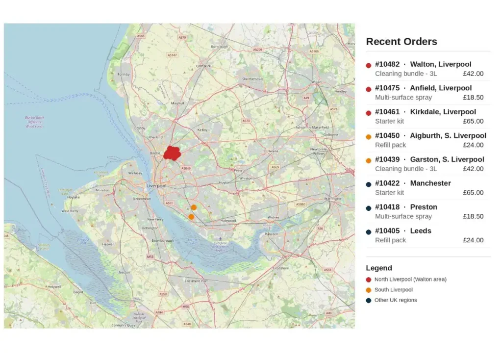
Now in this mock example, most in-store purchases cluster in the north of the city. Liverpool has a road called Queens Drive that roughly splits the city into north and south, and it’s tempting to read that straight off the map.
That opens up real questions. If we’re spending £100 a week on local advertising trying to drive people into the shop, is it actually working in the south of the city at all? Would that money go further spent closer to the store? Or is the honest answer that our offer isn’t strong enough to justify a 30 minute trip when there are competitors sitting right on the doorstep of South Liverpool customers?
It’s not always about distance
Proximity isn’t the only explanation for a divide like this, and it’s worth ruling out before you assume it’s the answer. If you sell clothes, you’ll sometimes see genuine trend differences between areas that have nothing to do with how far someone has to travel. Youths in one part of a city might be heavily into one brand while an area twenty minutes away is onto something completely different. Liverpool’s own football casual scene is a good example of this, certain brands became tied to specific areas almost like a local identity, rather than spreading evenly across the whole city in the form of hyperlocal trends.
So before putting the whole gap down to distance, it’s worth asking whether the offer itself is part of it too, wrong brands, wrong styling, wrong price point for what that particular area actually wants.
Using maps to decide where to open your next shop
If you are looking to expand with new stores, plotting your orders against a map also helps inform the decision on where that new location should be.
This is a stronger signal than most of what usually goes into a new location decision. Footfall counts and how a high street “feels” are still worth checking, but they’re guesswork about potential customers. A cluster of real orders is evidence of customers who already exist. You can also see whether your products are genuinely well received in an area or whether the odd order there is really just one-off.
It won’t replace the rest of the due diligence; rent, footfall, and lease terms all still matter. But knowing there’s already a proven customer base in an area before you sign anything turns “we think this location could work” into “we know people here already want to buy from us.”
Try Using A Map
If you’ve read this far and you’re still not sure whether it’s worth the effort, it is. You’ve almost certainly got the data already sitting in your system, so there’s no new spend and no real setup involved, just an export and a free geocoding tool to get pins on a screen.
I set this feature up for my clients where all new orders are automatically plotted on a map and I find it useful in a range of scenarios. I actually started using this method when I used to run local paper advertisements to measure ROI of specific campaigns back over a decade ago.
Worst case, you spend an afternoon and confirm what you already suspected. Best case, you spot a cluster you didn’t know existed, a postcode that’s quietly outperforming everywhere else, or a chunk of local ad spend that’s never had a real chance of working. Either way you walk away with something a standard sales report was never going to show you.
You’ve got nothing to lose by looking. The only real mistake is leaving the data sitting there unused.